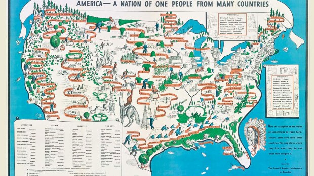
In the years leading up to the Second World War, there was a particularly strong suspicion of immigrants among Americans. As a response, a New York based organization called the Council Against Intolerance commissioned a map in 1940 by an illustrator named Emma Bourne. It was called “America — A Nation of One People From Many Countries,” and its purpose was to remind people that, with the exception of the Native American, all Americans or their immediate ancestors came from other nations. Atlas Obscura shares the story:
Bourne illustrates America’s unique ethnic and religious diversity by erasing state borderlines and showing the nation as one unit. Long red ribbons weave through the landscape to show clusters of immigrant groups and where they settled, from Japanese in the West to Italians in the East. At the bottom left is an inset scroll listing famous Americans in literature, science, industry, and the arts alongside their ethnic backgrounds, including George Gershwin and Albert Einstein, who became a U.S. citizen the year the map was published.
This particular map was part of an array of materials created and distributed by the Council — founded by a Jewish author named James Waterman Wise — to “fight against prejudice by calling attention to American ideas, heroes and traditions.” At the time, the map also forwarded the Council’s position that “prejudice could undermine national unity during wartime.”
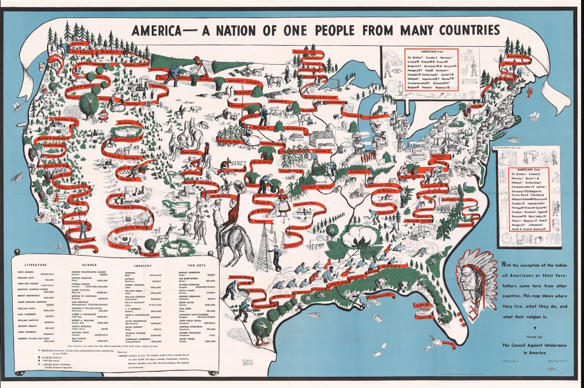
Maps like this were uncommon at the time — both because its size and because of the fact that it was “unique in its emphasis and display of information,” according to Ian Fowler, director of Osher Map Library at the University of Southern Maine.
A range of religions is represented on the map and everyone on it is engaged in some kind of industry or labor, which was intended to show that “immigrants are not ‘lazy,’” Bourne says.
Some have noted weaknesses in Bourne’s map, which could detract from its purpose: First, it didn’t represent the African American population at the time very well, which apparently compelled the poet Langston Hughes to annotate his copy with a burning cross and a reference to the Ku Klux Klan near the cotton workers in the South. The map also left out the Native American populations.
Still, it did catch the attention of Eleanor Roosevelt, who wrote about it favorably in her newspaper column, My Day(in which she also shared what may have been the first presidential “endorsement” of a favorite American campfire treat — s’mores!).