Lenten Campaign 2025
This content is free of charge, as are all our articles.
Support us with a donation that is tax-deductible and enable us to continue to reach millions of readers.
When thinking of Renaissance art, the chances are high that you might think of masterpieces like Michelangelo’s “The Creation of Adam” or Leonardo Da Vinci’s “The Last Supper” -- two iconic paintings that strike the viewer for their lifelike quality. Compare these works with medieval paintings like the wondrous golden altar panel of Siena’s cathedral by Duccio di Doninsegna and you will surely notice a key difference between Renaissance works and medieval paintings: the use of perspective.
The word “perspective” comes from the Latin verb “perspicere” which means to “see through.” In art, it stands to signify the ability to represent three-dimensional objects on a two-dimensional surface. For thousands of years, from Egyptian art to Byzantine mosaics, artworks lacked a sense of depth, with subjects appearing in two dimensions.
It wasn’t until the 15th century that painters included a third dimension in their works, thanks to the use of linear perspective. The style offered artists a way of creating an illusion of depth by arranging visual subjects along a system of parallel lines that converge in a single vanishing point.

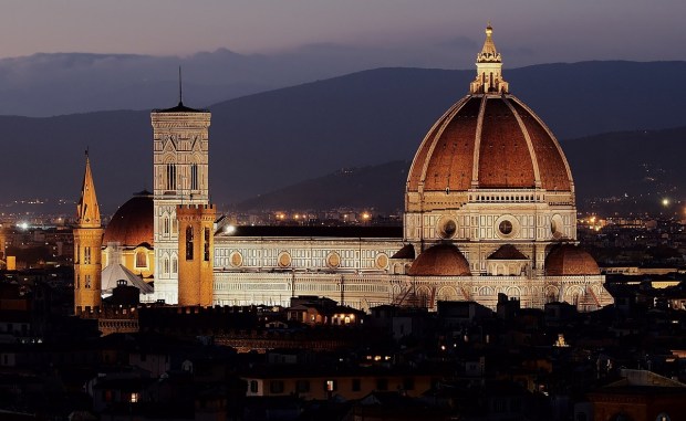
Filippo Brunelleschi, the father of Renaissance architecture who famously designed the iconic dome of Florence’s cathedral, is considered the “inventor” of perspective. In a famous experiment, he calculated the mathematical proportions between different parts of Florence’s Baptistery to make objects closer to the viewer appear larger, creating a three-dimensional feel. His ideas about the use of perspective in art were published in the 1435 treatise “On Painting” by Leon Battista Alberti.
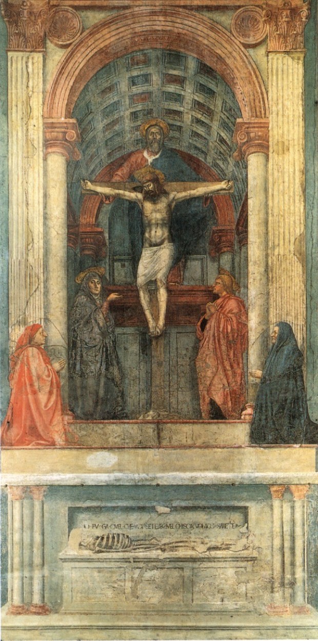
Following Brunelleschi’s innovation, many artists started to incorporate the principle of perspective in their work. When the Lenzi family commissioned Florentine artist Masaccio with an altarpiece for Florence’s Santa Maria Novella Church, he rendered the subject, the crucifixion, according to the principles of perspective. The barrel-vaulted niche seems to curve upwards; the Lenzis, depicted in kneeling position at the foot of the cross, look closer to the viewer compared with Christ, who is the central subject of the painting.

For “The Last Supper,” Leonardo placed Christ at the center acting as the central vanishing point of convergence of all the lines in the painting. Specifically, the lines all converge to Christ’s right eye, inviting the viewer to direct their gaze towards this point when looking at the painting.
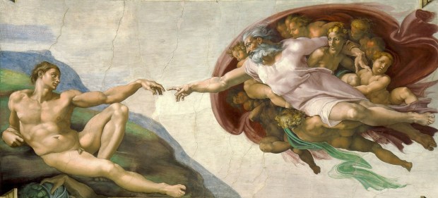
In “The Creation of Adam,” Michelangelo created a feeling of distance between God and Adam by using linear perspective. Here, all lines converge towards the hands of God and Adam, the point that most viewers will naturally find themselves looking at when gazing at this famous Sistine Chapel’s fresco.


